Friday, 12 November 2010

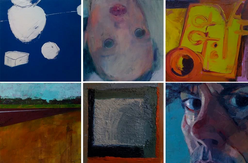
Image Wall - The Exhibition


At the beginning of the year, I was invited by Black Swan Arts in Frome to stage an exhibition in their Round Tower Gallery, a unique stone-walled, circular space, that was originally built in the eighteenth for drying fabric. I knew instantly that I did not want the show to be a predictable resumé of all the work I’d done so far. Rather, I found it more appealing to imagine how the gallery would look if it were filled with bright, shiny new paintings, in a medium I was unfamiliar with. And then I took the idea a stage further. A dozen new paintings, I could imagine that easily, but what about one hundred? If I worked solidly from May to November, painting abstracts, still-life, portraits, landscapes and everything in between, what would my one hundredth painting look like? And what kind of painter would I have become?
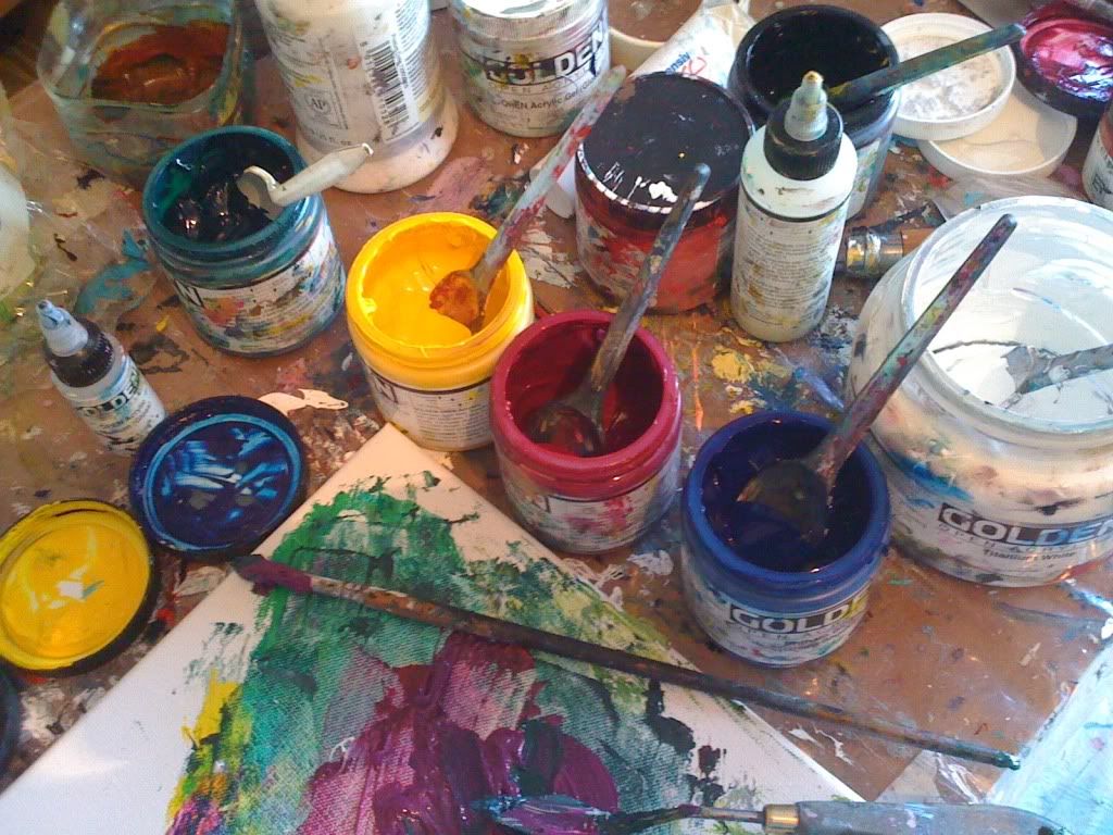
I chose six slow-drying acrylic colours (including black and white), I bought pots of moulding paste and pumice gel and ordered one hundred canvases. Each one was to be just 30 x 30 cm square, about the size of a vinyl album sleeve.
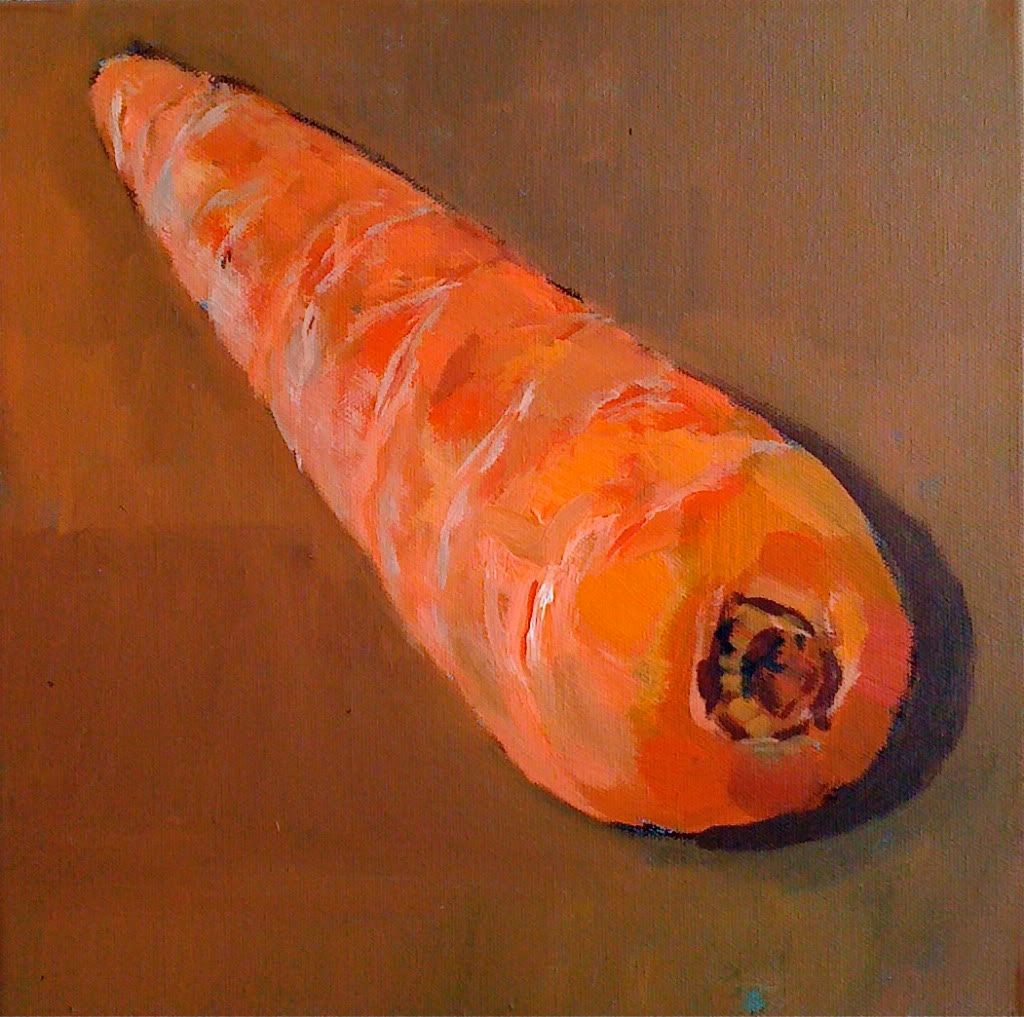
I painted my first picture in early May:
Thinking of carrots and sticks and Cezanne’s words:
“The day is coming when a single carrot, freshly observed, will set off a revolution.”
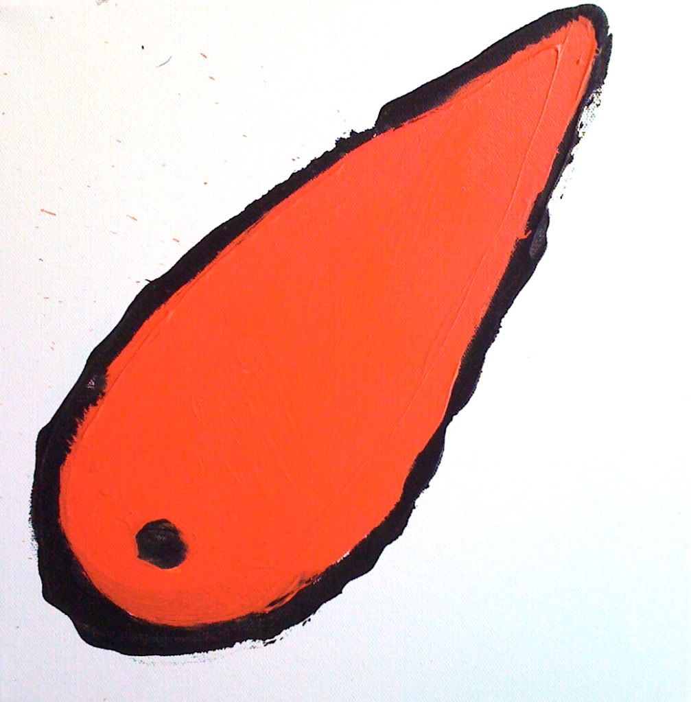
The revolution did not come, so I painted another carrot and then I hit a snag, in the form of painting holidays and nine weeks in France and Italy.
It was quite a nice problem to have; I worked with so many wonderful people, both at l’Age Baston and Studio Paradiso, but it meant that on my return, if I was to meet my November deadline, I would have to paint at the rate of one and a half pictures per day.
I thought of Turner and the twenty-four thousand watercolours he painted in his lifetime. And I thought of Van Gogh and the eighty masterpieces he produced during the eight months he spent in Arles with Gaugin.
“Inspiration is born of hard work and not the other way around,” said Stanislavski.
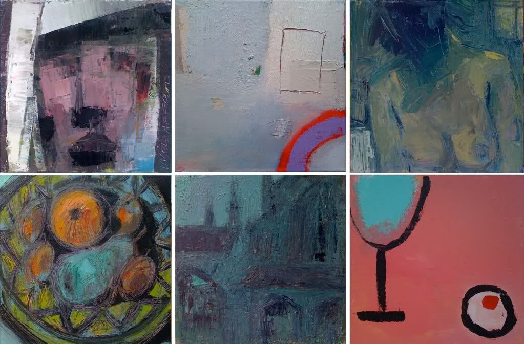
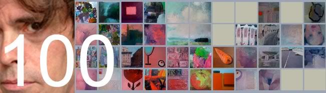
If you’re curious to know what the one hundredth painting looks like:
IMAGE WALL
A personal journey in 100 canvases, painted between May and November 2010 
The Round Tower Gallery
2 Bridge Street
Frome
Somerset BA11 1BB
Tel: 01373 473 980
27 November to 24 December (please visit Black Swan Arts website for opening times).

And if Frome is simply too far away, I’ll post the image soon on http://theimagewall.blogspot.com
“This is my way of holding onto things. Friction against the slippery slope of modernity; smooth as a flat screen TV, you can touch but not feel. Painting slows us down, but makes us more alive; opens a window on a world full of possibilities and entirely free of interruptions from our sponsor. Jawlensky described art as nostalgia for God. It's taken me 100 canvases to understand what that meant.
Painting and longing are one and the same.”
Chandler 2010

Saturday, 18 September 2010

A Grey And White Matter


To be creative, I'm told, our brains need a goodly amount of low integrity white matter. Grey matter is good for rational, logical thinking but it tends to hold onto concepts too rigidly to create eureka moments. Those serendipitous conjunctions of true genius are caused by the white stuff, leaking ideas all over the cerebral cortex. 


The tendency amongst my students is to approach each painting with their grey matter. They have a concept in their minds of the desired outcome and they see the act of painting as a kind of test of their ability to achieve it. I, on the other hand, am more excited about the white matter; about the possibility that something unexpected may occur; something outside my usual repertoire. The business of painting is ideal for this kind of enterprise. It begins the moment you mix one colour with another and ask the question, 'what if...?' 


Even if there is nothing intrinsically new in art (or the universe) there are still an infinite number of untried, untested combinations for us to get excited about.

Tuesday, 14 September 2010

Image Wall - Artist's Statement

For many years, I have been a teacher of art, not a practicing artist. My focus has been on how to encourage others to develop their ability and to throw some light on the numerous techniques and processes that may be employed in picture-making. Because I had neither the time or the resources, the question I never asked myself was, what kind of a painter am I?
Image Wall  is an attempt to find an answer to that question.
Painting one hundred pictures, was to be like going on a journey. I could take a few risks along the way and fully explore what happens when you put paint onto canvas. I could work in ways I wouldn’t normally dream of, with colour-combinations I wouldn’t normally dare to use. All judgements were to be treated with suspicion and there would be no plan. I would simply paint whatever I had the urge to and if the work had a theme, it would be an unconscious one.
From my teaching, I have come to realise that there as many ways to paint a picture as there are people on the planet. The canon of Art, moreover, is being constantly up-dated; the first abstract artists are long-dead; installations and video seem old-hat. and the art world is poised for its next big, money-making shock. Meanwhile, all over the world, it is the flat screen, not the canvas, that is king. 

Despite digital sampling, CGI and a thousand images at the click of a mouse, however, painters still hold onto their pigment, their glue and their cloth. Unlike LEDs, these things have substance. A good painting doesn’t only occupy space, it alters it. The brushstroke is an echo of the artist’s presence and his or her colours leave chemical imprints in the mind of the viewer. I was seven years old, the first time a work of art did that to me and I was so thrilled, it scared me.
Pablo Picasso, when asked which of his paintings was his favourite, said, ‘The next one.’ When I began work on Image Wall, I had ninety-nine ‘next one’s. That is a kind of luxury.
I am grateful to the Black Swan Arts for their invitation to exhibit; to Ciara Nolan for her encouragement with my initial idea; to Suzanne Cooke for studio space and to Studio Prints of Frome for their generous support.

Friday, 10 September 2010

Art Words

Eminent: to be nearly as famous as Tracy Emin.
Hirst: funerary vehicle used in the transportation of pickled animals.
Hopper: container for the storage of depressing works of art.
Distemper: the feeling one gets after viewing abstract art.
Schwitters: bowel movement brought on by a visit to a Dadaist exhibition.
Kapoor: (onomatopoeia) disappointing explosion from a wax cannon.
Pre-Raphaelite: someone who leaves a charity event immediately after the buffet.
Monetise: the act of decorating a waiting-room with cheap reproductions of Impressionist art.
Flemish Art: any painting that is predominately snot-coloured.
Boschian Landscape: apocalyptic style of painting in which human figures are devoured by vacuum cleaners.
Postmodern: the junk that arrives on the doormat every morning.
Gormley: to look stupid but to actually be worth quite a lot of money.

Monday, 12 July 2010

Shadow Poetry

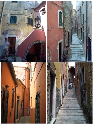
Imagine a Cornish fishing village, raked up even more impossibly steeply on its hillside, the grey and white houses dipped in Mediaeval red dye and pushed together so tightly that there is little more than a shoulder's width between one side of the street and the other. Then picture the entire arrangement teetering down to a tiny quayside and the blue-green water of the Mediterranean.

This is Tellaro on the Bay of Poets, where Byron swam and Shelley drowned.


Every year, when I'm teaching at Studio Paradiso, near Fivizzano in the Lunigiana, we bring a group of artists here to sketch and paint. The colours are mesmerising. On a sunny day, the red walls bounce the light around so much that when you escape from their labyrinthine twists and turns and arrive at last upon the quayside, the sea looks even greener.  You get the strong impression that Sixteenth century Italians knew all there was to know about simultaneous contrast.

The quayside is too tiny for all but the smallest rowing boats but there's room for a few sunbathers. The Italians lie upon the rocks, sweltering and evincing a certain reluctance to go anywhere near the water. There are sea urchins lurking there, as I found out to my cost.


But my appointment with the sea urchins has to come later. My students are all settled on the quayside, getting to grips with Tellaro's tricky perspectives and I have to find something to paint.


But it's hot and the sun is relentless. It looks like my choice of painting is to be dictated by something far more pressing than aesthetics: shelter. There's also that constant nagging I give myself when I'm on a painting trip, to do something pedagogical.


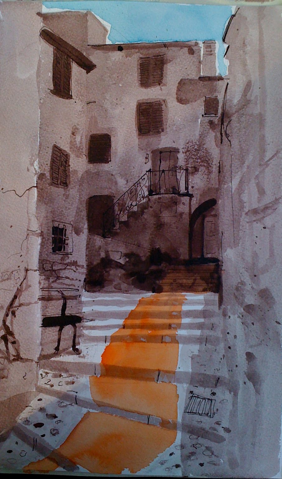
The spot I choose is shady enough and the parapet makes a useful workbench. I have visions, however, of my No.12 sable rolling over the edge into the drink. My painting is going to be suitably pedagogic, too. You can see that I've underpainted it in dilute bistre ink. Bistre is an old colour originally derived from boiling soot. This new version is a pleasingly transparent, reddish brown and as it's waterproof, it won't lift when I put colour over it; not that there will be much colour in my painting. Tellaro is a colourful place, I know, but those steep streets and mediaeval high-rises cast wonderful shadows. And it's the drama of light and shade that I want to depict.


The dilute bistre granulates nicely, giving me natural-looking textures and the details are ticked in with a dip pen. Schmincke Translucent Orange on the steps, Cerulean in the sky. I manage to leave just enough white paper around the tops of those buildings to make the whole thing look hot and back-lit.


Tuesday, 18 May 2010

A Few Portraits


Two paintings of footwear. One by by contemporary artist, Michael Taylor, the other by Vincent Van Gogh.

What is the difference between them?

$ 8,970,000,  you might say as both were sold at auction a year ago and the Van Gogh realised $ 9,000,000. But then, Taylor hasn't initiated a major art movement and changed the course of painting to boot (forgive the pun).

So what is the difference?

I show both images to my students and the Taylor instantly appeals. Alongside it, the Van Gogh appears dour and colourless. The Taylor, on the other hand is beautifully rendered and there are lots of little details to beguile the eye. In his careful treatment of the girl's shoes, the fabric of the chair, the carnations on the armrests, he shows us just how well he can paint - and there it ends; a contrived, yet nevertheless superb demonstration of the artist's skill.

Van Gogh, on the other hand, in painting less seems to reveal more of himself. His shoes constitute not such much a still-life as yet another portrait of the artist who regarded portraiture as the chief genre for modern painters. We feel as if we can deduce the personality who discarded them; we sense the labouring that has been done in them and the landscapes they have traversed. The person here is inferred, painted as it were, from the bottom up. Like all great works, the painting hints at something beyond the mere depiction of the objects concerned.

I bring a few old pairs of shoes to the art class and everyone is instantly gripped. They are such sad things; empty shells.  No props; I try to place them as if they've only just been discarded and it is strangely like having the ghost of the wearer in the room with us.

process cyan, magenta, yellow & black acrylic


neutral tint, sepia & burnt sienna watercolour


phthalo green, neutral tint & quinacridone violet watercolour

Sunday, 9 May 2010

Oceans Apart Part 2

Of the paintings I produced for 'Oceans Apart' the new group show at Air Gallery, Wells, this has become the favourite and curiously, it's the only one that ended up pretty well the way that I planned it.


Painting exactly what I had in my mind has always seemed a terribly difficult thing to do. I think I know how my picture is going to look but when it actually begins to take shape on the canvas, it is either a stunted abortion that is fit only to be sacked up and hurled over a parapet or is so astonishingly promethean that it takes on a life of its own and flies away from me.

I take some comfort from these words by the Swiss painter and sculptor Alberto Giacometti:

"I wanted to know if something could be imagined so precisely that it could be made exactly as imagined.  And that's a very long exercise, because you can be mistaken, you think you see it clearly, but when you want to do it, the whole thing has disappeared.  I know I spoke to another sculptor of this attempt to realise exactly what I saw in my mind.  He said it was impossible; he said that if you really begin to realise, it, your way of seeing changes. And you discover that the vision you thought you had was very very vague, that it has to be transformed in order to be realised."

This is what Francis Bacon meant by working with what the brushstroke suggested.


It seems to me that it's also what Turner had in mind when he said 'I never lose an accident.'


Which equates with Klee's dictum to 'make the accidental essential.'


Plan it, draw it out and colour it in without deviation and you'll end up with something that looks as if it was painted by numbers. Like an over-rehearsed conjuring trick, the life will have gone out of your work.

But if your time and your skill are not enough, what then is required?


Kandinsky said that one could learn the craft of carpentry and be fairly certain of being able to make a table, but one might learn how to paint and never be certain of making a work of art.

The uncertainty, of course, is what makes the whole enterprise so exciting. In my experience, people who can't cope with uncertainty, tend not to become artists.

So what happened this time, when I actually ended up with what I'd planned?


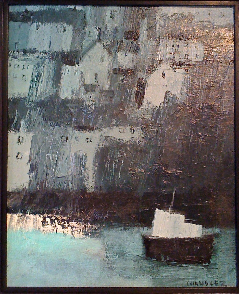
When you look closely at the picture, you'll see it's built up on quite a lot of paint. Under the surface are three or four other paintings that formed as the image took on a life of its own and I followed first one course, then another. To give you some idea of how often I change my mind, here are three other treatments of the same scene; the harbour at St. Ives:


You'll notice that in each of these, the boats are either safe on the harbour wall or tied up along the quayside. In my favourite painting, the boat is at sea at last, but whether arriving or departing, it is impossible to say. Certainly, there is nowhere in sight for the pilot to put ashore.

If your painting ends up as planned, you may well have gone on that long journey that finally takes you home.

But perhaps it means that your little boat never put out to sea in the first place.