Showing posts with label Vincent Van Gogh. Show all posts

Friday, 20 April 2012

Stale and Hockneyed?

For the past month, during discussions at my art classes, the name of one artist has cropped up over and over again. That artist is David Hockney. Now a grand old man of British art, his recent exhibition, A Bigger Picture at the Royal Academy, attracted half a million visitors, making it one of the Academy's most popular shows to date.

When Hockney set up his studio in his mum's old house in Bridlington and began painting watercolours of East Yorkshire, a number of people, including me, were dubious. Hockney's candy colours and decorative textures seemed more at home in California than the dour North of England. Covering Provence in violet and yellow, as Van Gogh did, seemed to make sense, but when was Yorkshire ever emerald green and pink? Does Hockney really have something to say about landscape or has he merely turned the RA into a stage set for a camp version of Babes In The Woods?


Hockney is a prolific painter and clearly has the stamina of an artist half his age. Most of the work on display at the Royal Academy was created over the past three or four years and some of the canvases are enormous. In his own words, the pictures are very "new and fresh as well"  and to his credit, he has got people thinking about landscape all over again.


But what about those inappropriate colours? it seems that 
Hockney has successfully done the same trick with the countryside that Turner did with those gamboge sunsets of his and re-defined it for the rest of us through his own vision. Visitors to the exhibition tell me that, now, when they look at the English countryside, they see Hockney's colours. They're finding his candied orange and parma violet in the country lanes and copses in the South as well as the North. They were hiding in the hedgerows all along and we just needed someone with Hockney's visual acuity to point them out for us.

Saturday, 22 October 2011

The Power of Art and the Art of Freedom


The one work of art I should love to see, that I know I never will see, is Filippo Lippi’s drawing of his Moorish master.  Done in 1423, when he was seventeen, with a fire-blackened stump on a white-washed wall, it was the portrait that freed him from slavery and saved him from a premature death, chained to the oars of a Moorish galley.  Regardless of it’s technical merit, it must rank as one of the most sublime examples ever of the power of art.

Filippo probably had little idea that the drawing would earn him his freedom, but something drove him to produce it all the same.  Perhaps he had some notion that by flattering his subject he might make his own life a little easier.  He had been a compulsive scribbler since the age of eight.  That is why when the Prior of the Carmelite Convent where he was educated, found that little Filippo had drawn all over his prayer book, he turned him over to a drawing master.  Now, with things at their worst, Filippo Lippi simply turned to what he knew best.

What’s certain is that we cannot ascribe to Filippo, at that time, the popular view of the artist as concupiscent, tormented genius churning out expensive artefacts for the privileged few.  And I doubt very much that his master had any thoughts about preserving the drawing or dismantling the white-washed wall and selling it.  As an investment then, it would have been worthless, but by granting him his freedom, Filippo’s owner made a direct investment in the life of the artist himself. The whole of Filippo Lippi’s life’s-work sprang from that moment, when the master of slaves gazed at his portrait and recognised in it more than his own face.

So how does this square with today’s painter?  Many of us paint as a hobby, a pastime - and we feel there’s something inferior about that idea, don’t we?  But is that actually any worse than painting for money?

What would you rather be? A professional who does it for money or an amateur who does it for love?

Many of us, like Fillippo Lippi, simply feel compelled to do it.  But why?  Are we day-dreaming?  Merely doodling our time away?  Do we mind at all if all we create fulfils its destiny in the dusty space under the bed?  If that’s so, is painting for us just an elaborate form of therapy?

Good paintings, though, seem to work on several other levels too.

Firstly, the colours and marks alone may engage us with their vivacity in the same abstract way as music can.

Secondly, there is the story that the artist is attempting to tell.  It may sound banal but every picture does tell a story. 


When Monet paints a landscape, for example, he might be telling you a story about the passing of time; when Millet paints a landscape, that story might be about the life of the French peasant; when Van Gogh paints his landscape, it could well be the story of his own mental disintegration.


Thirdly and most importantly, every painting needs a viewer, just as every piece of music needs a listener or it might as well never exist. 

And what happens in the mind of the viewer can be utterly magical.

Think of the Moorish slave master.

Be aware of the power of Art in the minds of others. 

And draw and paint, if you feel so compelled, but do it like Filippo, as if your freedom depended upon it.

Friday, 12 November 2010

Image Wall - The Exhibition


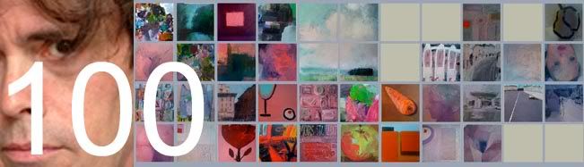
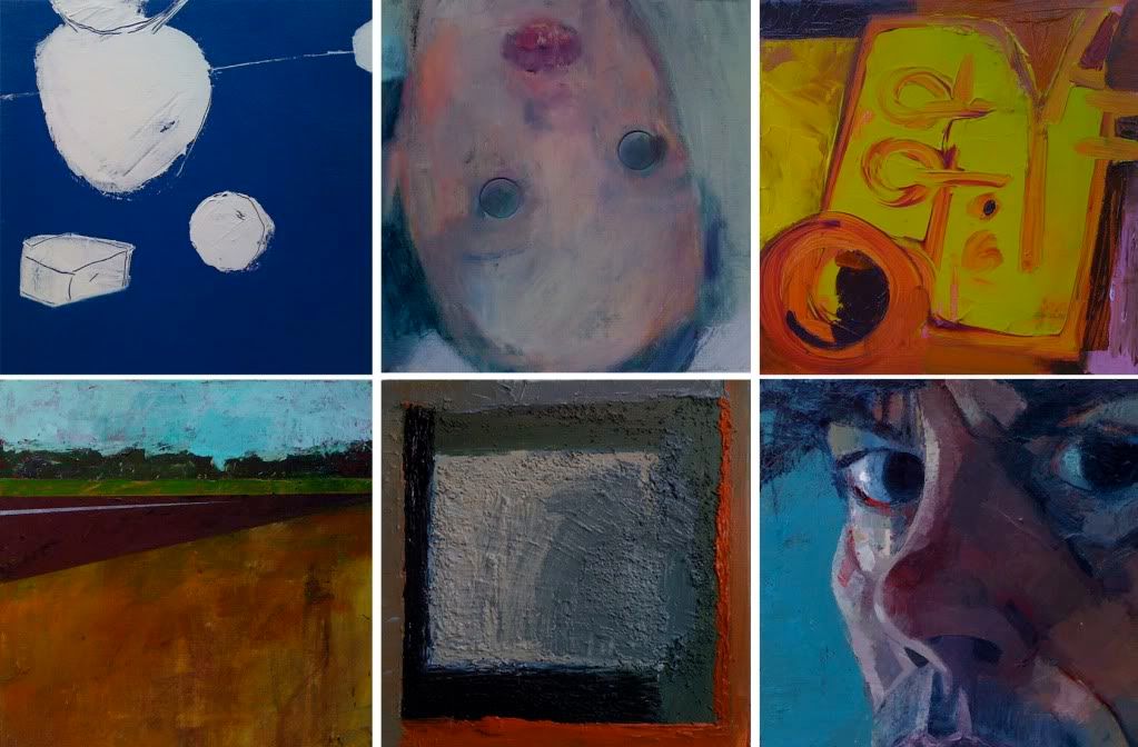
At the beginning of the year, I was invited by Black Swan Arts in Frome to stage an exhibition in their Round Tower Gallery, a unique stone-walled, circular space, that was originally built in the eighteenth for drying fabric. I knew instantly that I did not want the show to be a predictable resumé of all the work I’d done so far. Rather, I found it more appealing to imagine how the gallery would look if it were filled with bright, shiny new paintings, in a medium I was unfamiliar with. And then I took the idea a stage further. A dozen new paintings, I could imagine that easily, but what about one hundred? If I worked solidly from May to November, painting abstracts, still-life, portraits, landscapes and everything in between, what would my one hundredth painting look like? And what kind of painter would I have become?
I chose six slow-drying acrylic colours (including black and white), I bought pots of moulding paste and pumice gel and ordered one hundred canvases. Each one was to be just 30 x 30 cm square, about the size of a vinyl album sleeve.
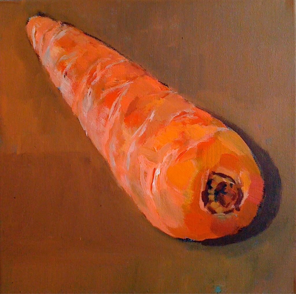
I painted my first picture in early May:
Thinking of carrots and sticks and Cezanne’s words:
“The day is coming when a single carrot, freshly observed, will set off a revolution.”
The revolution did not come, so I painted another carrot and then I hit a snag, in the form of painting holidays and nine weeks in France and Italy.
It was quite a nice problem to have; I worked with so many wonderful people, both at l’Age Baston and Studio Paradiso, but it meant that on my return, if I was to meet my November deadline, I would have to paint at the rate of one and a half pictures per day.
I thought of Turner and the twenty-four thousand watercolours he painted in his lifetime. And I thought of Van Gogh and the eighty masterpieces he produced during the eight months he spent in Arles with Gaugin.
“Inspiration is born of hard work and not the other way around,” said Stanislavski.
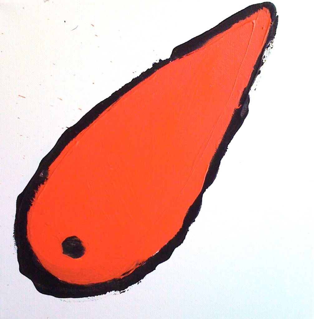
If you’re curious to know what the one hundredth painting looks like:
IMAGE WALL
A personal journey in 100 canvases, painted between May and November 2010 
The Round Tower Gallery
2 Bridge Street
Frome
Somerset BA11 1BB
Tel: 01373 473 980
27 November to 24 December (please visit Black Swan Arts website for opening times).

And if Frome is simply too far away, I’ll post the image soon on http://theimagewall.blogspot.com
This is my way of holding onto things. Friction against the slippery slope of modernity; smooth as a flat screen TV, you can touch but not feel. Painting slows us down, but makes us more alive; opens a window on a world full of possibilities and entirely free of interruptions from our sponsor. Jawlensky described art as nostalgia for God. It's taken me 100 canvases to understand what that meant.
Painting and longing are one and the same.”
Chandler 2010

Tuesday, 18 May 2010

A Few Portraits


Two paintings of footwear. One by by contemporary artist, Michael Taylor, the other by Vincent Van Gogh.

What is the difference between them?

$ 8,970,000,  you might say as both were sold at auction a year ago and the Van Gogh realised $ 9,000,000. But then, Taylor hasn't initiated a major art movement and changed the course of painting to boot (forgive the pun).

So what is the difference?

I show both images to my students and the Taylor instantly appeals. Alongside it, the Van Gogh appears dour and colourless. The Taylor, on the other hand is beautifully rendered and there are lots of little details to beguile the eye. In his careful treatment of the girl's shoes, the fabric of the chair, the carnations on the armrests, he shows us just how well he can paint - and there it ends; a contrived, yet nevertheless superb demonstration of the artist's skill.

Van Gogh, on the other hand, in painting less seems to reveal more of himself. His shoes constitute not such much a still-life as yet another portrait of the artist who regarded portraiture as the chief genre for modern painters. We feel as if we can deduce the personality who discarded them; we sense the labouring that has been done in them and the landscapes they have traversed. The person here is inferred, painted as it were, from the bottom up. Like all great works, the painting hints at something beyond the mere depiction of the objects concerned.

I bring a few old pairs of shoes to the art class and everyone is instantly gripped. They are such sad things; empty shells.  No props; I try to place them as if they've only just been discarded and it is strangely like having the ghost of the wearer in the room with us.

process cyan, magenta, yellow & black acrylic


neutral tint, sepia & burnt sienna watercolour


phthalo green, neutral tint & quinacridone violet watercolour

Friday, 16 April 2010

Dogs and Cats and Chemistry

It's a relief, on occasion, to turn away from the business of trying to make art and focus instead on simply recording what's in front of you.

When Van Gogh was painting with Gaugin in Arles, he attempted to use the latter's method of painting from memory and imagination. In the end, he had to concede that his best work was done when the subject was slap-bang in front of him.  More than anything, though, Van Gogh wanted sitters to paint from and frustratingly for him, all but a few of the good people of Arles avoided him like the plague. To the great benefit of the rest of us, the isolation forced upon him by his apparent craziness gave rise to the most powerful paintings of objects the world has seen; those iconic, yellow-on yellow sunflowers, for example, that have become universally synonymous with artistic struggle.

So what to paint turns out not to be the issue for most artists. If you love to paint, then you'll paint anything; sunflowers, chairs, boots, even the bedroom furniture. The real issue for most of us is how. Ten years of monkish devotion to art  and Vincent had that down pat, but it's something I've been struggling with for decades.


Thank providence then for the limitations of watercolour. Compared with oils and acrylic, there's so much that they won't do and so much that they do quite readily that is irksome. They stain, they run, they bloom and most vexing of all, they won't let you hide your mistakes. And the Bistre ink that I like to use, flocculates when heavily diluted and leaves texture where you don't want it.

Why use it?

I suppose because some us are dog-owners, while others prefer cats.

Oil and acrylic are dogs. They follow you faithfully, sit down and roll over when they're told and won't do anything without your say-so. Watercolours on the other hand, are cats. Whatever you have in mind, they are on their own agenda; winding themselves around your shins one minute and off through the cat-flap the next.

Van Gogh was a fan of watercolour, although he didn't exploit the medium much, declaring that you needed twenty-seven heads to paint a single picture.

It's Dorothy's birthday. I always paint daisies for her birthday card. Almost overnight, they've perked up all over the lawn and with their bright faces, they match her sunny, uncomplicated disposition. Pinching them out of the soil, however and laying them on the table in front of me, I feel as if I'm performing a botanical autopsy. But right now, rather than any new meaning I've conferred upon them, I'm more interested in the shapes they're making on my paper.

Call it artistic detachment.

After the sketch done in soft pencil, the bistre goes on, speckling, quite predictably in unpredictable places. I'm squinting at my daisies now, cutting down the colour information that's hitting my retina and concentrating on light and shade. Colour, tone, form, texture - Nature delivers them all at once and we separate them out like charity shop workers going through a bin bag. More bistre goes on once the first glaze is dry and then I get to work with thin phthalo green watercolour. Odd names. One ancient; one modern. The bistre, originally derived from boiling soot; the phthalocyanine, a petro-chemical by-product.

It's all chemistry.

Brushing aside any concerns about my carbon footprint, I finish the job with a little Translucent Yellow.

The Bistre, besides texturing the picture has tamed the watercolour; harmonised my colours, modified their tones and given the whole thing structure. The watercolour, you see, didn't have it all it's own way. But then again, neither did I and that's where the real chemistry is.