Friday, 8 February 2013

Gainsborough And The Perils Of Broccoli Before Bedtime


Thomas Gainsborough (1727-1788) wasn't much of a one for travel. While other artists were risking their necks and their reputations on the European Grand Tour, Gainsborough wished for nothing more than to walk off to "some sweet Village where [he] could paint landskips."


But, more often than not, in order to paint pictures like this, he would venture no further than his own parlour.

"He would make models - or rather thoughts - for landscape scenery on a little old-fashioned folding oak table... This table, held sacred for the purpose, he would order to be brought to his parlour, and thereupon compose his designs. He would place cork or coal for his foregrounds; make middle grounds of sand or clay, bushes of mosses and lichens and set distant woods of broccoli."


The first bit is easy. You pay a visit to your local greengrocer, splurge on broccoli, celeriac and the dirtiest parsnips you can find; buy some cocktail sticks and a kilo of Blu Tack, so that your broccoli trees will stand up straight and invest in a few mirror tiles from Ikea. Garnish with a sprig of rosemary from the garden.


If you're really committed to your art, as Gainsborough obviously was, you can crush the mirrors so that your otherwise unconvincing pond will at least have a few ripples in it. Gainsborough also used sulphurous lumps of whiting and wet coal, but I'd forget about that unless you can equip yourself with a pair of tongs. But if you really want to live dangerously, as Gainsborough obviously did, you may complete your panorama with a handful of brussels sprouts.


It isn't easy to spot the brussels sprouts in a Gainsborough landscape, but according to his rival Joshua Reynolds, that's exactly what he used. Perhaps he used them for the clouds.

Now for the hard part.


Paint your landscape so that it actually looks like a landscape and not, well... chopped vegetables.


A few sketches to check your composition will help, but most important of all...
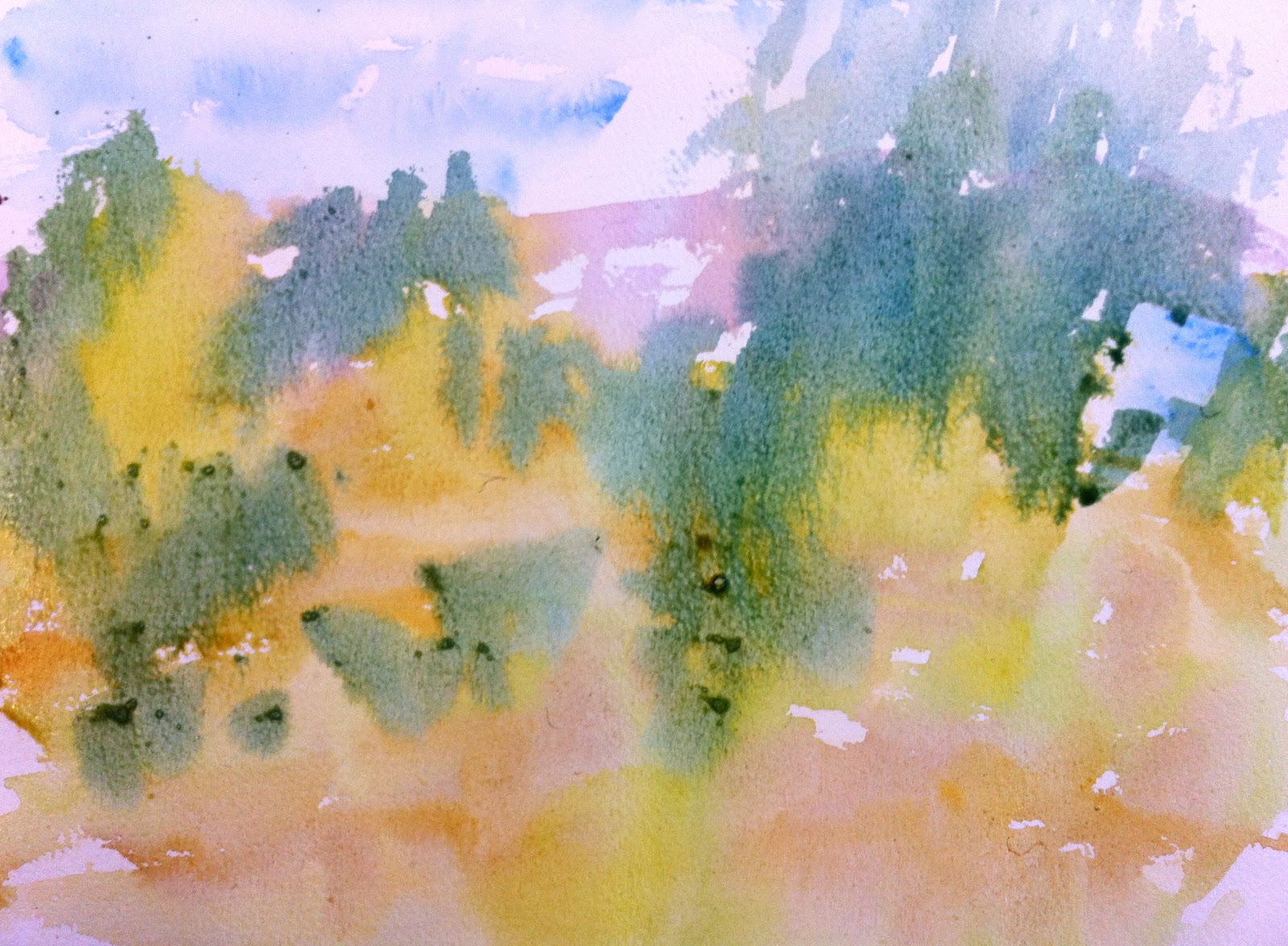


Use your imagination.


According to Margaret, one of his daughters, Gainsborough had to give up this pleasurable pastime because, "he thought he did not sleep so well after having applied to drawing in the evening not being able to divest himself of the ideas which occupied his mind."

Too much broccoli has the same effect on me too.

Images courtesy of the Claverton Art Group, Bath, Somerset, UK.


Saturday, 1 December 2012

The Art Of Changing The World

Chris Wise likes to explore the heavens with his telescope, he likes to play the guitar, and he likes to doodle. More than most, he appreciates the power of the doodle and when he talks, it's like listening to more doodling. You have no idea where he's going or what he'll end up with, but the loops and swirls and branches will develop in the most fascinating way. Sometimes the doodle stops making sense; there are jumps, non-sequiturs, but they always lead back to theme.

The theme is improving the world for benefit of mankind.

Which, he says, is what engineers do.

The Millennium Bridge began with a doodle. So, too, did the London 2012 Velodrome.

Big projects worth millions of pounds that involved hundreds of people with innumerable specialties, that began in a humble way.

With a line.

But how else, is one supposed to begin?


I write this over and over again when I take drawing and painting classes. So often, our attempts to create are confounded by an all-too-reasonable desire to impress.

Chris Wise has won many prestigious awards and is a fellow of RIBA, the RSA and the Royal Academy of Engineering who granted him their most prestigious medal. He has worked all over the world with the likes of Rogers, Foster and Piano. His work is useful, impressive and changes lives and it all began in a back bedroom with a doodle.

The link to his company website is here.

At the end of his talk at Rook Lane Arts recently, a member of the audience asked Wise for some advice about his son, who hoped to be an engineer. He was about to take a year out after his studies and he wanted to know if his son should accept an internship, play his violin or climb Mount Kilimanjaro. Wise replied that if the man's son wanted a job, he should take the internship.

"That's what I told him," said the man, somewhat triumphantly.

"But," said Wise, "If he wants to be a better engineer, he should play his violin or climb a mountain."

Here's a brief animation of the talk that Chris Wise gave. I made it in real-time on the iPad, as he spoke, using the Brushes 2 app.


Saturday, 6 October 2012

The Holburne Portrait Prize 2012


Mr Lindsay Clarke, author (acrylic on canvas)


This portrait of Lindsay Clarke is not an attempt to lay bare the character of an award-winning writer but rather to use his magnificent head to make a simple painting, in which no clues are given and the sitter’s gaze becomes irrelevant. It was accomplished after a single sitting, during which more time was spent on conversation, beer and cakes than on art. Emblem or icon; the result looks like it belongs on a postage stamp, a Roman coin or a banknote but somehow, Clarke’s character still seems to percolate through the inert, polymerised pigment.

To see the prize-winning portraits, click here.

Thursday, 6 September 2012

Art and Wine


For many artists, matters of the palette and the palate are inextricably linked. Just look at all the sumptuous still-lifes in our museums and art galleries; the tables laden with food; bright fruit on glimmering pewter and glistening crystal cradling darkly glowing wine. Contrast that with the popular trope of the starving artist, bartering a freshly-painted masterpiece at the bistro, for a platter of bread and cheese and a carafe of vin de table.

Although the painter may be wedded to one sense in particular, there is a good chance that he or she is not completely divorced from the pleasures afforded by the others. These two still-lifes by Picasso and Braque are celebrations of all our senses, and a bottle of wine lurks in both. When we are carried away by sound or colour, do we not call ourselves 'intoxicated'?


Google 'art and wine' and you'll get 365,000,000 results. Festivals combining the two abound. At every exhibition opening night I've ever attended, wine is the natural accompaniment. Nothing else quite stimulates the senses while loosening the inhibitions, the tongue and the purse strings.

So when I was invited by Jason Yapp to illustrate Yapp Brothers' 2013 wine list, I didn't hesitate to accept. I knew that I'd be in extremely good company. Willie Rushton, Glen Baxter, John Burningham and Quentin Blake have all illustrated the Yapp Brothers' wine list before. And I also knew that I'd be cosying up to some delectable wines. We're all sensualists. Yapp Brothers care about their taste buds and their olfactory epithelia as much as I do about my retinas.

Wine arouses passion; it has its stories and its landscapes and it's a natural subject for the artist. But where to begin?

I decided to restrict myself to the iPad. With the summer taken up with residential courses at home and abroad, I'd have few opportunities for studio work. As long as I remembered to pack my charger, I could 'paint' wherever I happened to be. And using the Brushes and ArtRage apps would help to create a fresh identity for the list and help to keep the visuals graphically simple. The iPad also gave me an opportunity to make discoveries and to work outside the realm of the frozen tableau that is the artist's traditional domain. 

This is Chateau Fouquet, home of the Filliatreau's and a rather good Cabernet Franc.


Tuesday, 12 June 2012

Bottling Your Painting Holiday - Part 2

I've just returned from ten fantastic days at Studio Paradiso with our hosts, Dermot and Kathryn. As we were operating out of a new venue this year, on the Torrentello Estate in the Lunigiana, we gave ourselves a little time before the students arrived to make notes and prepare...


Then all we had to do was wait for our guests.

With all the usual domestic chores taken care of by someone else (thank you, Sarah) and delicious, local food put under their noses at appropriate hours of the day (thank you Dermot and Kathryn), artists of all abilities could look forward to a whole week of undiluted, uninterrupted art... and a landscape that transforms from beguiling beauty to recalcitrant wretch with every stroke of the brush.

The problem?

Well, just what are you going to do with all that scenery?

Just how are you supposed to get all that green, all those trees, mountains, footpaths, telegraph poles and bee orchids onto your little bit of paper? Suddenly, all your colours are wrong and while you see magic all around you, all that ends up in your sketchbook is scribble.

Funny how all the "me" time that you've been looking forward to for weeks, can turn into "poor me" time in less than twenty-four hours.

Thank goodness for vino locale and Torrentello's wood-fired pizza oven, is all I can say.


 So, what's the answer?

Temper all that ambition with a little realism, I say.

The landscape is a complex phenomenon of shadows and light, of colour, sensation and memory and you're going to capture it all on a bit of mashed up wood pulp, a stick with some animal hair tied to one end and blobs of different coloured dirt mixed with glue?

 I don't think so.

Alberto Giacometti, Swiss born sculptor and painter, said that "in order to realise something" you had "to transform it." In other words, stop trying to get what's 'out there' onto your canvas and start trying to get what's 'in there' out. Pay attention to yourself and your materials. And keep asking the following question:
The fact is, the landscape will keep on changing while you're working on it. It is a repository of infinite moods. Your painting isn't. Every year, wherever I teach, I write this on the board in bigger and bigger letters.

What you end up with won't be the landscape you saw - leave that behind you, in Italy or France or wherever else you find yourself - but it will be what happened when you tried to paint the landscape you saw.

That's valid, isn't it?

Russian composer, Igor Stravinsky wrote a tremendously difficult solo for the bassoon at the beginning of his masterwork, The Rite Of Spring. Rightly daunted by the prospect of playing it before the maestro, the chief bassoonist went away and practiced and practiced until he'd got it note perfect. At the next rehearsal, however, Stravinsky was far from satisfied with the bassoonist's efforts. When he remonstrated with the composer that he'd worked hard until he could play it perfectly and that in his opinion, he'd played it faultlessly, Stravinsky told him that he didn't want the sound of someone playing it perfectly; he wanted the sound of someone trying to play it.

Every landscape is perfect, but you are only human. That's the kind of realism I admire.

Set painting for Stravinsky's The Rite Of Spring by Nicholas Roerich

Friday, 20 April 2012

Knowing Your App From Your Elbow

Besides the sweet shop shrubbery and tree trunks the colour of liquorice allsorts, the other abiding image of Hockney this year has been of the maestro himself, sitting and sketching, with a fag in one hand and an iPad in the other. It's enlightening to see an acknowledged great working in a medium that hitherto has been the province of children, geeks and fantasy artists. One imagines it's a bit like watching that other David - Beckham - playing Subbuteo; only less likely.  But there it is, hundreds of Hockney's iPad images have been appearing in respectable art galleries as well as online, so like it or not, thanks to Hockney, iPad art has achieved legitimacy with astonishing rapidity.


But what about the feel and the smell of oil paint? purists may say. How can these images be unique? Where's the skill?


Anyone who's tried to navigate the slick surface of an iPad screen, leaving a vapour trail of coloured pixels beneath their index finger, will know that the business requires a fine degree of manual dexterity and hand/eye co-ordination. The thing doesn't draw for you and if you're no good with pencil and paper, you'll be even worse with an iPad. Of course, it's a mass-produced item, but so too, is a tube of oil paint; at least since Winsor and Newton started making them in the 1830's. The nostalgists among us may lament the iPad's lack of tactility and its odourlessness but neither of these things are, in my view, prerequisites for great art. It has to look right way before I care whether or not it smells right. And as for the work's presence, its hand-made, artisan-crafted look, this has been a debate in art long before Damien Hirst started paying people to paint his dot pictures; before Warhol, too, in fact, when Pieter Breughel the Younger set up a factory to reproduce his dad's masterpieces back in the sixteenth century.


Although the iPad signals a huge change in the way we make art, it is not about to replace other paint media - yet. It is, however, an extremely valuable tool for the artist to add to his or her kitbag. Most usefully, it is paintbrush, pencil and paper combined. Most powerfully, it is both shop window and gallery, too.


So let's not spend too long worrying about whether or not the iPad signals the end of art any more than Vincent Van Gogh fretted about having his canvases shipped ready-made from Paris. Let us concentrate, instead, on the challenges that new technology offers the artist. By far the biggest for any iPad artist, has to be to give their work character, to transform that immutable little rectangle into a magic window that makes us look, with a fresh mind upon our world.

So what's new?

All images © David Chandler created on ArtRage for iPad.

David Chandler will be teaching art for iPad at Studio Paradiso (23 May - 2 June and 21 September - 5 October 2012), Chateau L'Age Baston (23 June - 21 July 2012), Exeter Phoenix (19 February 2013) and Dillington House (2 , 23 March & 4 July 2013).

Stale and Hockneyed?

For the past month, during discussions at my art classes, the name of one artist has cropped up over and over again. That artist is David Hockney. Now a grand old man of British art, his recent exhibition, A Bigger Picture at the Royal Academy, attracted half a million visitors, making it one of the Academy's most popular shows to date.

When Hockney set up his studio in his mum's old house in Bridlington and began painting watercolours of East Yorkshire, a number of people, including me, were dubious. Hockney's candy colours and decorative textures seemed more at home in California than the dour North of England. Covering Provence in violet and yellow, as Van Gogh did, seemed to make sense, but when was Yorkshire ever emerald green and pink? Does Hockney really have something to say about landscape or has he merely turned the RA into a stage set for a camp version of Babes In The Woods?


Hockney is a prolific painter and clearly has the stamina of an artist half his age. Most of the work on display at the Royal Academy was created over the past three or four years and some of the canvases are enormous. In his own words, the pictures are very "new and fresh as well"  and to his credit, he has got people thinking about landscape all over again.


But what about those inappropriate colours? it seems that 
Hockney has successfully done the same trick with the countryside that Turner did with those gamboge sunsets of his and re-defined it for the rest of us through his own vision. Visitors to the exhibition tell me that, now, when they look at the English countryside, they see Hockney's colours. They're finding his candied orange and parma violet in the country lanes and copses in the South as well as the North. They were hiding in the hedgerows all along and we just needed someone with Hockney's visual acuity to point them out for us.