
Monday, 12 October 2015

Friday, 9 October 2015
Complementary peppers


Schmincke Translucent Orange with Cobalt Blue; Indian Yellow with Quinacridone Violet and Viridian with Translucent Orange and Magenta (Viridian and Translucent Yellow stalks).
Sunday, 9 August 2015
Painting Between The Words

Jenny Holzer's solo exhibition at Hauser and Wirth, Somerset is predominantly about sex, war and death; a potent and often harrowing combination that the artist seems to treat somewhat at a distance with her trademark text-based work and minimalist aesthetic. Nevertheless, as you walk through the five galleries of this mini retrospective, there are heart-stopping and gut-wrenching moments everywhere. A small bench is engraved with the words "Die fast and quiet when they interrogate you or live so long that they are ashamed to hurt you anymore." Arranged neatly on two tables are human bones, each one ringed with a silver band, as you might a bird's leg, inscribed with the imagined words of rape victims. Declassified FBI documents are displayed on LEDs or painstakingly reproduced on large canvases. One, taken from a heavily-redacted statement, bears only a single word: "Waterboard."

Holzer always uses upper case text in her work as the important thing here, is not the way the words look, but how their bare meaning can gain a startling resonance in a different setting; be that on a bench or a canvas, or even on a t-shirt. For my Hauser & Wirth workshop, however, we we worked with words in an entirely different way; stripping them of their meaning by privileging the formal construction of the letters themselves and looking at the way that words can divide the picture plane.

By working on a fairly large scale, we could also play with the singular dynamic that is implicit in every letter. An N, for example, requires an entirely different movement of the writer to that of a B. Its expression on the canvas can be one of stability or movement; aggression or lyricism. In this way, we can create our own formal, abstract language that stands apart from the banal meaning of the words themselves.

"To lay bare the elements and group them into assembled subdivisions, to dissect and reconstruct into a whole simultaneously at various places, to create a visual polyphony and to bring about stillness by balancing movement, all these are aspects of form and are of great importance for the knowledge of form, but they are not yet art. In the uppermost circle, beyond ambiguity, there lies a final mystery, which the light of our meagre intellect fails to penetrate." Paul Klee (1879 - 1940)
Friday, 31 July 2015
Pencil To Paint Redux
The aim of my Pencil To Paint course is to explore the essential differences between the two disciplines and shed light on why many of us find it so difficult to move between the two. I meet many skilled draughtsmen and women who shy away from colour, saying that they either don't like it or need it or (more honestly, I think) confess that they don't really understand how to use it. When I was not so very much younger, a fellow artist who was looking over my work, stung me to the core when she remarked, "You're not a colourist, are you?"
It was true. I was fearless with a pen or a pencil, but with a brush and a set of paints, I descended into panic, swirling the brush around and around on the canvas as if I was stirring porridge, in the hope that I might get lucky and a brilliant painting would appear as if by magic.
All I ever got, in fact, was mud. Colour eluded me.
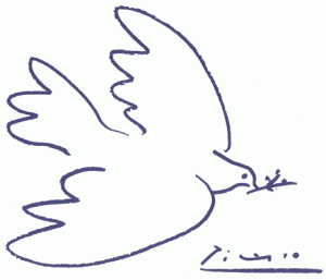
So what we'll do in Pencil To Paint, is begin by looking at what we do when we draw and we'll start by putting a line around things. It's what children do, quite naturally and it's also what Pablo Picasso did.
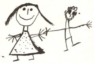
Part of the problem is that we know there isn't a line around real people and real birds: it's a convention. But it's one that will give us real trouble when we try to paint, if we take it for granted.
So, here's a way of depicting things that doesn't require a line:
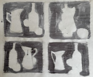
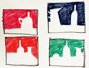
In these drawings, we're looking at the spaces that things occupy as well as the relationships between them. In Japanese brush painting, this is known as Notān, which literally translated, means 'sparse/dense' or 'light dark harmony.' It's a simple binary that will really clarify the compositional elements in your painting.

This is a piece of Notān that everyone knows. The black describes the white, which describes the black. The elements are perfectly interlocked and this must also be the case for your painting. When you fill a canvas, the spaces around things are as important as the things themselves. As with the sentences in a novel or the phrases in a piece of music, every part of the picture plane has to be considered.


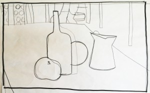
So I map my picture out in black and white and then add grey. It's much easier to tweak the composition at this point, when you've only got a few values to deal with. Note the addition of the black strip, the introduction of a table edge and the slight dropping of the 'horizon' line to the left of the bottle.
The next step is something of a leap, but this is where constant practise and familiarity with your chosen painting medium comes in - although, it will help if just this once, you forget the extravagance and squeeze out four times as much paint as you usually do onto your palette and (now you've thrown caution to the wind) use a brush that's at least twice as big as you ever thought you'd need.
It's no good dreaming big if all you ever do is act small.
We will, however, be keeping things simple and in Pencil To Paint, we'll play with just a couple of colours at first.

This is Process Cyan and Burnt Umber and with them, you can run the gamut of cool and warm tones, while making colour adjustments quite quickly and easily. Your browns, for example can only be bluish and your blues only brownish and if this feels restrictive, let's take another look at maestro Picasso again:

When I painted my demo' piece at Dillington House last week, I spent as much time on the space between the bottle and the jug as I did on either object. Using just two colours plus white enabled me to concentrate on how I was painting rather than what. And thinking about Notān (the harmonising of lights and darks in my composition), I soon realised that I needed to place the apple where it would lighten a part of the picture that would otherwise be quite dull (half-closing your eyes and squinting at the picture will help you to see this light/dark distribution more clearly).
With the tonal values of my colours balanced in this way, I needed only to add a thin glaze of yellow to my blue apple to complete the composition.

Okay. It isn't very elegant and it's certainly isn't realistic, but at least it looks the way I meant it.
"Art is a lie that makes us realize truth." Pablo Picasso (1881 - 1973)
Tuesday, 14 April 2015
The Ever-Fresh Pleasure of a Useless Occupation

"Le plaisir delicieux et toujours nouveau d'un occupation inutile."
Ravel inscribed these words by Henri de Régnier on the title page of his score for Valses Nobles et Sentimentales; an indication that, despite his fascination with the waltzes of Schubert, he was fully aware of the almost mindless gaiety of the Viennese ballroom and the self-satisfied pleasure that led to the catastrophic Great War.
The delicious and ever-fresh pleasure of a useless occupation.

The French were ensconced at the table with their families, the streets were empty and I was free to wander. When I had completed my first circuit of the city, gawping at the grandeur of the municipal architecture and the vast public spaces that are such anathema to English town-planning, I realised that I had more than enough time to do it all over again... and again. I had a date at 4pm and here I was at 11am, my belly already full of coffee, croissants and municipal architecture, with six hours to go and no desire for an early lunch. What was I to do?
In his excellent book, The Art Of Travel, Alain de Botton describes so well the kind of lethargy and incuriosity that can overwhelm us in foreign places and at such times. During a trip to Madrid, he chose to malinger under the bedsheets in his hotel room rather than endure the tourist slog around the town, imbibing historical and geographical tidbits from an almost reproachful guidebook. The hardest thing, he wrote, was to take pleasure in lying there, whilst knowing that just outside the room was an exotic, new world, just waiting to be explored.
We feel, so often, like disembodied observers when we visit other places and cultures. We blink at the world from the other side of our goldfish bowl without any true feeling of engagement or belonging, conscious always that like the holiday clothes in our suitcases, we will shortly be bundled up and carted back to a place of familiarity, where the boredom of routine can seem infinitely preferable to the disconcerting tedium of our present anomie.

Clearly, it was time for me to do that thing; to mitigate the unfamiliarity of my circumstances and my present ennui with an activity with which I have had the greatest propinquity for more than fifty years:

My own delicious and ever-fresh pleasure; the useless occupation of drawing.

At a life-class, a student with severe back problems once told me that drawing was a more effective analgesia than his TENS machine and at the Society of Disabled Artists meetings in Frome, where I taught for several years, many of our members found that drawing (and painting) made their chronic pain go away and for a time, made them forget that life for them was not 'normal.' This is no surprise as drawing is neurally demanding, engaging as it does, the hand and the eye as well as the brain in an extraordinary synchronicity of movements and measurements. And it is that rare thing; entirely autonomous, self-directed labour, the end result of which is yours and yours alone, to do with as you will. Added to that, drawing changes the act of observation from a passive to an active one and reinvigorates your curiosity in the world. With the rekindling of that curiosity, lethargy vanishes. The municipal building is no longer on the other side of the goldfish bowl but right there, under your hand, along with the rest of the city. You have internalised it in a very conscious way and you may find that even when the drawing is done, your rekindled curiosity continues to grow rather than diminish.

Now I am home again, regardless of any artistic merit they might have, I look with pleasure at the drawings in my sketchbook because I can remember the circumstances in which they were made with a kind of clarity that is absent from the rest of my trip. In The Art Of Travel, de Botton suggests that travel 'twists our curiosity according to a superficial geographical logic.'
I'm inclined to think that drawing unravels it again.
Sunday, 17 August 2014
Verging On The Sublime
Klosters' heyday as the winter playground of English royalty is long over but there are no echoes of nostalgia or signs of faded glory about the town's immaculate streets. The whole place is so bright, so spic, span and affluent that it can make an English visitor quite heady. If the altitude doesn't make you swoon, the lack of litter and graffiti will. The sunlight is sharp in the crisp mountain air and everything it touches gleams. The spacious shops are bright with the rainbow colours of hiking gear and pool wear. Mountain bikes, tennis rackets and Norwegian walking poles abound. Winter or summer, Klosters is focussed on the life lived out-of-doors and that is why so many people still take the little red train from Landquart and venturing this far up the Prättigau valley, alight just one stop before Davos. Above the town, the green pastures which swathe the mountain slopes are neater than an English lawn and dotted with old wooden barns that are better kept than any palace. To me, the valley looked so fresh and perky, the entire place could have been a built overnight, just before I arrived.

So here I am, back in Klosters again as a guest of Marianne and Tore Bergengren, rudely awoken by the cart which washes the streets at 7am, peering out of my apartment window at the sun-kissed, verdant slopes that end in those jagged slabs of rock way above my head. And I'm wondering what I'm going to do with them. The trees, the barns, the waterfalls dangling silently from each distant pinnacle like threads of silver, they're all so tiny against the massy rock. Enormous shadows swing about the valley. If you're on the wrong hillside, twilight may reign for hours on end. Unless the sun is directly overhead, it's almost impossible to tell what time of day it is. There's only one kind of majesty in Klosters nowadays; it has ruled the land for centuries and still holds dominion over my mind as I write this, two weeks later.

Just how do you fit a mountain on a sheet of watercolour paper?
The Swiss philosopher, Jean-JacquesRousseau identified the healthy individual as one who was free from the corruption of modern civilised society and (not for the first time) equated the natural world with the idea of innocence. Similarly, the English poet, Samuel Taylor Coleridge proclaimed a 'visionary fondness for fields and woods and mountains,' which he believed, kept the 'bad passions' in inaction. In the eighteenth century, thinkers, writers and poets alike, began to look to Nature to define and determine our moral, as well as our mental and emotional states. The time was right therefore, for an art that reflected these preoccupations. That art, was the art of the landscape and the medium that was best-suited to the purpose, was watercolour.


Nothing, however, could capture those vast expanses and wide skies quite as effectively as humble water soluble pigment on paper.

By why the pre-occupation with lofty crags and deep ravines?

The English essayist and politician, Joseph Addison, after undertaking the Grand tour through France, Switzerland and Italy in 1699, declared that "The Alps fill the mind with an agreeable kind of horror."
This is the frisson that Andrew Wilton refers to in his introduction to 'The Great Age Of British Watercolours,' which we may experience when we are confronted by high waterfalls, cliffs, mountains, oceans or storms and our instinct for self-preservation is threatened. This awareness that we are pitted and measured against almighty forces that overshadow and overwhelm us, acquired a moral dimension through the work of philosophers like Kant and Burke and developed into the concept of the Sublime in nature; a concept that was commensurate with, but separate from, that of beauty. In 'A Philosophical Enquiry,' Burke's investigation into the origin of our ideas of beauty and the sublime, the philosopher even went so far as to suggest a quasi-physiological cause for the frisson that is evoked by vast and lofty visual phenomena. The retina, Burke claimed, is so excited by scanning so many successive data points of information that the eye vibrates almost to the point of pain, and consequently 'must produce an idea of the sublime.'

The Sublime was finally overwhelmed by the industrialising forces that spawned it and the Great War decimated the ruling class that both sponsored and patronised it. The work of Freud and Jung, meanwhile, suggested a different trajectory for artistic endeavour and the Grand Tour was replaced with an equally hazardous inward journey. After the welter of radical and sensational 'ism's that characterised twentieth century art, John Robert Cousins and the other watercolourists of Britain's Great Age, could easily be mistaken for mere nostalgists, rather than the plumbers of the human spirit that they were.


So here I am, back in Klosters again as a guest of Marianne and Tore Bergengren, rudely awoken by the cart which washes the streets at 7am, peering out of my apartment window at the sun-kissed, verdant slopes that end in those jagged slabs of rock way above my head. And I'm wondering what I'm going to do with them. The trees, the barns, the waterfalls dangling silently from each distant pinnacle like threads of silver, they're all so tiny against the massy rock. Enormous shadows swing about the valley. If you're on the wrong hillside, twilight may reign for hours on end. Unless the sun is directly overhead, it's almost impossible to tell what time of day it is. There's only one kind of majesty in Klosters nowadays; it has ruled the land for centuries and still holds dominion over my mind as I write this, two weeks later.
Just how do you fit a mountain on a sheet of watercolour paper?
The Swiss philosopher, Jean-JacquesRousseau identified the healthy individual as one who was free from the corruption of modern civilised society and (not for the first time) equated the natural world with the idea of innocence. Similarly, the English poet, Samuel Taylor Coleridge proclaimed a 'visionary fondness for fields and woods and mountains,' which he believed, kept the 'bad passions' in inaction. In the eighteenth century, thinkers, writers and poets alike, began to look to Nature to define and determine our moral, as well as our mental and emotional states. The time was right therefore, for an art that reflected these preoccupations. That art, was the art of the landscape and the medium that was best-suited to the purpose, was watercolour.
John Robert Cozens: Between Martigny and Chamonix
English watercolourists, in fact, had been articulating these preoccupations for many years previously, but it must be born in mind that their medium was seen as a rather lowly one and worse, the stinging words of Michelangelo must have rung still in the ears of many an art-lover, when he called landscape art 'a vague and deceitful sketch; a game for children and old men.'
JMW Turner South gate of Sargans (after JRC)
Francis Towne: La Chaperieux
John Warwick Smith: Alpine Bridge
This is the frisson that Andrew Wilton refers to in his introduction to 'The Great Age Of British Watercolours,' which we may experience when we are confronted by high waterfalls, cliffs, mountains, oceans or storms and our instinct for self-preservation is threatened. This awareness that we are pitted and measured against almighty forces that overshadow and overwhelm us, acquired a moral dimension through the work of philosophers like Kant and Burke and developed into the concept of the Sublime in nature; a concept that was commensurate with, but separate from, that of beauty. In 'A Philosophical Enquiry,' Burke's investigation into the origin of our ideas of beauty and the sublime, the philosopher even went so far as to suggest a quasi-physiological cause for the frisson that is evoked by vast and lofty visual phenomena. The retina, Burke claimed, is so excited by scanning so many successive data points of information that the eye vibrates almost to the point of pain, and consequently 'must produce an idea of the sublime.'
Salvador Dali: Soft Construction With Boiled Beans
The Sublime was finally overwhelmed by the industrialising forces that spawned it and the Great War decimated the ruling class that both sponsored and patronised it. The work of Freud and Jung, meanwhile, suggested a different trajectory for artistic endeavour and the Grand Tour was replaced with an equally hazardous inward journey. After the welter of radical and sensational 'ism's that characterised twentieth century art, John Robert Cousins and the other watercolourists of Britain's Great Age, could easily be mistaken for mere nostalgists, rather than the plumbers of the human spirit that they were.
The Sublime, courtesy of EasyJet
No one has to risk traversing the Mont Cenis Pass in a wicker basket these days and the alternative coastal journey to Italy is relatively free of Moorish pirates. And thanks to the democratising effect of the camera, the Sublime is within easy reach of anyone with a mobile 'phone and a reservation on a budget flight. A contemporary version of the Sublime would also have to include the routinely breathtaking images captured by the crew of the International Space Station.
Earth from the ISS
Astronomy raises the bar by light years.
Omega Nebula by NASA, ESA and J. Hester (ASU)
Back on Earth in Klosters, I know that I will never climb the peaks that dominate my every waking moment.
Chandler: Silvretta Alps
Chandler: From Gotschnagrat
Chandler: Muggenwald
I have to find my own way of conquering them.
Subscribe to:
Posts (Atom)