The aim of my Pencil To Paint course is to explore the essential differences between the two disciplines and shed light on why many of us find it so difficult to move between the two. I meet many skilled draughtsmen and women who shy away from colour, saying that they either don't like it or need it or (more honestly, I think) confess that they don't really understand how to use it. When I was not so very much younger, a fellow artist who was looking over my work, stung me to the core when she remarked, "You're not a colourist, are you?"
It was true. I was fearless with a pen or a pencil, but with a brush and a set of paints, I descended into panic, swirling the brush around and around on the canvas as if I was stirring porridge, in the hope that I might get lucky and a brilliant painting would appear as if by magic.
All I ever got, in fact, was mud. Colour eluded me.
So what we'll do in Pencil To Paint, is begin by looking at what we do when we draw and we'll start by putting a line around things. It's what children do, quite naturally and it's also what Pablo Picasso did.
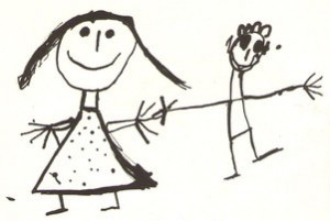
Part of the problem is that we know there isn't a line around real people and real birds: it's a convention. But it's one that will give us real trouble when we try to paint, if we take it for granted.
So, here's a way of depicting things that doesn't require a line:
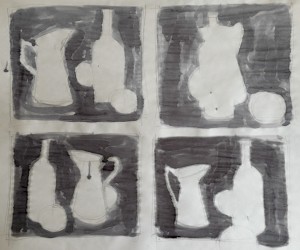
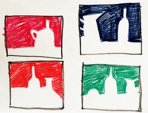
In these drawings, we're looking at the spaces that things occupy as well as the relationships between them. In Japanese brush painting, this is known as Notān, which literally translated, means 'sparse/dense' or 'light dark harmony.' It's a simple binary that will really clarify the compositional elements in your painting.

This is a piece of Notān that everyone knows. The black describes the white, which describes the black. The elements are perfectly interlocked and this must also be the case for your painting. When you fill a canvas, the spaces around things are as important as the things themselves. As with the sentences in a novel or the phrases in a piece of music, every part of the picture plane has to be considered.


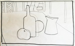
So I map my picture out in black and white and then add grey. It's much easier to tweak the composition at this point, when you've only got a few values to deal with. Note the addition of the black strip, the introduction of a table edge and the slight dropping of the 'horizon' line to the left of the bottle.
The next step is something of a leap, but this is where constant practise and familiarity with your chosen painting medium comes in - although, it will help if just this once, you forget the extravagance and squeeze out four times as much paint as you usually do onto your palette and (now you've thrown caution to the wind) use a brush that's at least twice as big as you ever thought you'd need.
It's no good dreaming big if all you ever do is act small.
We will, however, be keeping things simple and in Pencil To Paint, we'll play with just a couple of colours at first.

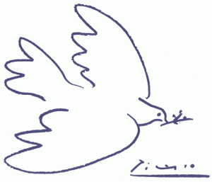
This is Process Cyan and Burnt Umber and with them, you can run the gamut of cool and warm tones, while making colour adjustments quite quickly and easily. Your browns, for example can only be bluish and your blues only brownish and if this feels restrictive, let's take another look at maestro Picasso again:

When I painted my demo' piece at Dillington House last week, I spent as much time on the space between the bottle and the jug as I did on either object. Using just two colours plus white enabled me to concentrate on how I was painting rather than what. And thinking about Notān (the harmonising of lights and darks in my composition), I soon realised that I needed to place the apple where it would lighten a part of the picture that would otherwise be quite dull (half-closing your eyes and squinting at the picture will help you to see this light/dark distribution more clearly).
With the tonal values of my colours balanced in this way, I needed only to add a thin glaze of yellow to my blue apple to complete the composition.

Okay. It isn't very elegant and it's certainly isn't realistic, but at least it looks the way I meant it.