Monday, 12 July 2010

Shadow Poetry

Imagine a Cornish fishing village, raked up even more impossibly steeply on its hillside, the grey and white houses dipped in Mediaeval red dye and pushed together so tightly that there is little more than a shoulder's width between one side of the street and the other. Then picture the entire arrangement teetering down to a tiny quayside and the blue-green water of the Mediterranean.

This is Tellaro on the Bay of Poets, where Byron swam and Shelley drowned.


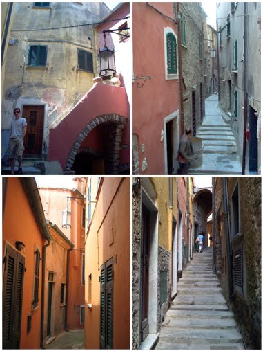
Every year, when I'm teaching at Studio Paradiso, near Fivizzano in the Lunigiana, we bring a group of artists here to sketch and paint. The colours are mesmerising. On a sunny day, the red walls bounce the light around so much that when you escape from their labyrinthine twists and turns and arrive at last upon the quayside, the sea looks even greener.  You get the strong impression that Sixteenth century Italians knew all there was to know about simultaneous contrast.

The quayside is too tiny for all but the smallest rowing boats but there's room for a few sunbathers. The Italians lie upon the rocks, sweltering and evincing a certain reluctance to go anywhere near the water. There are sea urchins lurking there, as I found out to my cost.


But my appointment with the sea urchins has to come later. My students are all settled on the quayside, getting to grips with Tellaro's tricky perspectives and I have to find something to paint.


But it's hot and the sun is relentless. It looks like my choice of painting is to be dictated by something far more pressing than aesthetics: shelter. There's also that constant nagging I give myself when I'm on a painting trip, to do something pedagogical.


The spot I choose is shady enough and the parapet makes a useful workbench. I have visions, however, of my No.12 sable rolling over the edge into the drink. My painting is going to be suitably pedagogic, too. You can see that I've underpainted it in dilute bistre ink. Bistre is an old colour originally derived from boiling soot. This new version is a pleasingly transparent, reddish brown and as it's waterproof, it won't lift when I put colour over it; not that there will be much colour in my painting. Tellaro is a colourful place, I know, but those steep streets and mediaeval high-rises cast wonderful shadows. And it's the drama of light and shade that I want to depict.


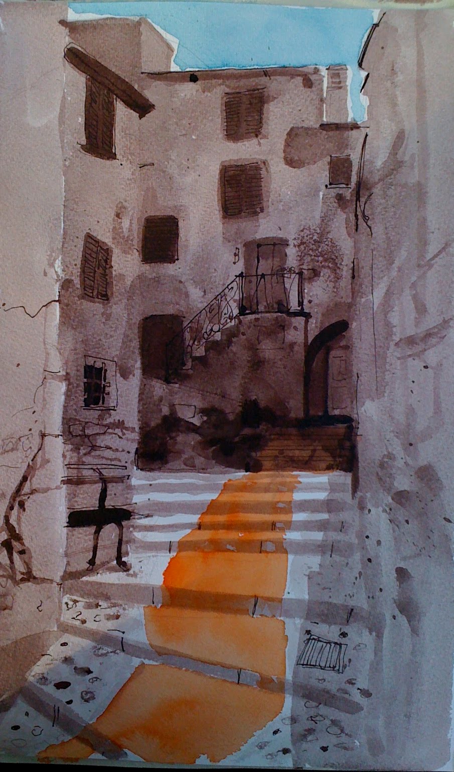
The dilute bistre granulates nicely, giving me natural-looking textures and the details are ticked in with a dip pen. Schmincke Translucent Orange on the steps, Cerulean in the sky. I manage to leave just enough white paper around the tops of those buildings to make the whole thing look hot and back-lit.


Tuesday, 18 May 2010

A Few Portraits


Two paintings of footwear. One by by contemporary artist, Michael Taylor, the other by Vincent Van Gogh.

What is the difference between them?

$ 8,970,000,  you might say as both were sold at auction a year ago and the Van Gogh realised $ 9,000,000. But then, Taylor hasn't initiated a major art movement and changed the course of painting to boot (forgive the pun).

So what is the difference?

I show both images to my students and the Taylor instantly appeals. Alongside it, the Van Gogh appears dour and colourless. The Taylor, on the other hand is beautifully rendered and there are lots of little details to beguile the eye. In his careful treatment of the girl's shoes, the fabric of the chair, the carnations on the armrests, he shows us just how well he can paint - and there it ends; a contrived, yet nevertheless superb demonstration of the artist's skill.

Van Gogh, on the other hand, in painting less seems to reveal more of himself. His shoes constitute not such much a still-life as yet another portrait of the artist who regarded portraiture as the chief genre for modern painters. We feel as if we can deduce the personality who discarded them; we sense the labouring that has been done in them and the landscapes they have traversed. The person here is inferred, painted as it were, from the bottom up. Like all great works, the painting hints at something beyond the mere depiction of the objects concerned.

I bring a few old pairs of shoes to the art class and everyone is instantly gripped. They are such sad things; empty shells.  No props; I try to place them as if they've only just been discarded and it is strangely like having the ghost of the wearer in the room with us.

process cyan, magenta, yellow & black acrylic


neutral tint, sepia & burnt sienna watercolour


phthalo green, neutral tint & quinacridone violet watercolour

Sunday, 9 May 2010

Oceans Apart Part 2

Of the paintings I produced for 'Oceans Apart' the new group show at Air Gallery, Wells, this has become the favourite and curiously, it's the only one that ended up pretty well the way that I planned it.


Painting exactly what I had in my mind has always seemed a terribly difficult thing to do. I think I know how my picture is going to look but when it actually begins to take shape on the canvas, it is either a stunted abortion that is fit only to be sacked up and hurled over a parapet or is so astonishingly promethean that it takes on a life of its own and flies away from me.

I take some comfort from these words by the Swiss painter and sculptor Alberto Giacometti:

"I wanted to know if something could be imagined so precisely that it could be made exactly as imagined.  And that's a very long exercise, because you can be mistaken, you think you see it clearly, but when you want to do it, the whole thing has disappeared.  I know I spoke to another sculptor of this attempt to realise exactly what I saw in my mind.  He said it was impossible; he said that if you really begin to realise, it, your way of seeing changes. And you discover that the vision you thought you had was very very vague, that it has to be transformed in order to be realised."

This is what Francis Bacon meant by working with what the brushstroke suggested.


It seems to me that it's also what Turner had in mind when he said 'I never lose an accident.'


Which equates with Klee's dictum to 'make the accidental essential.'


Plan it, draw it out and colour it in without deviation and you'll end up with something that looks as if it was painted by numbers. Like an over-rehearsed conjuring trick, the life will have gone out of your work.

But if your time and your skill are not enough, what then is required?


Kandinsky said that one could learn the craft of carpentry and be fairly certain of being able to make a table, but one might learn how to paint and never be certain of making a work of art.

The uncertainty, of course, is what makes the whole enterprise so exciting. In my experience, people who can't cope with uncertainty, tend not to become artists.

So what happened this time, when I actually ended up with what I'd planned?


When you look closely at the picture, you'll see it's built up on quite a lot of paint. Under the surface are three or four other paintings that formed as the image took on a life of its own and I followed first one course, then another. To give you some idea of how often I change my mind, here are three other treatments of the same scene; the harbour at St. Ives:


You'll notice that in each of these, the boats are either safe on the harbour wall or tied up along the quayside. In my favourite painting, the boat is at sea at last, but whether arriving or departing, it is impossible to say. Certainly, there is nowhere in sight for the pilot to put ashore.

If your painting ends up as planned, you may well have gone on that long journey that finally takes you home.

But perhaps it means that your little boat never put out to sea in the first place.

Friday, 7 May 2010

Oceans Apart Part 1


Work by Duncan Cameron, David Chandler, Rob Irving, Lorna Heaysman, Jeanette Kerr, Simon Ledson, Melissa Olen

Air Gallery, 6 High Street Wells, Somerset, BA5 2SG

8th May to 12th June 2010


Watch This Space


Click here: Image Wall

100 canvases for Black Swan Arts, November 2010.

Friday, 16 April 2010

Dogs and Cats and Chemistry

It's a relief, on occasion, to turn away from the business of trying to make art and focus instead on simply recording what's in front of you.

When Van Gogh was painting with Gaugin in Arles, he attempted to use the latter's method of painting from memory and imagination. In the end, he had to concede that his best work was done when the subject was slap-bang in front of him.  More than anything, though, Van Gogh wanted sitters to paint from and frustratingly for him, all but a few of the good people of Arles avoided him like the plague. To the great benefit of the rest of us, the isolation forced upon him by his apparent craziness gave rise to the most powerful paintings of objects the world has seen; those iconic, yellow-on yellow sunflowers, for example, that have become universally synonymous with artistic struggle.

So what to paint turns out not to be the issue for most artists. If you love to paint, then you'll paint anything; sunflowers, chairs, boots, even the bedroom furniture. The real issue for most of us is how. Ten years of monkish devotion to art  and Vincent had that down pat, but it's something I've been struggling with for decades.


Thank providence then for the limitations of watercolour. Compared with oils and acrylic, there's so much that they won't do and so much that they do quite readily that is irksome. They stain, they run, they bloom and most vexing of all, they won't let you hide your mistakes. And the Bistre ink that I like to use, flocculates when heavily diluted and leaves texture where you don't want it.

Why use it?

I suppose because some us are dog-owners, while others prefer cats.

Oil and acrylic are dogs. They follow you faithfully, sit down and roll over when they're told and won't do anything without your say-so. Watercolours on the other hand, are cats. Whatever you have in mind, they are on their own agenda; winding themselves around your shins one minute and off through the cat-flap the next.

Van Gogh was a fan of watercolour, although he didn't exploit the medium much, declaring that you needed twenty-seven heads to paint a single picture.

It's Dorothy's birthday. I always paint daisies for her birthday card. Almost overnight, they've perked up all over the lawn and with their bright faces, they match her sunny, uncomplicated disposition. Pinching them out of the soil, however and laying them on the table in front of me, I feel as if I'm performing a botanical autopsy. But right now, rather than any new meaning I've conferred upon them, I'm more interested in the shapes they're making on my paper.

Call it artistic detachment.

After the sketch done in soft pencil, the bistre goes on, speckling, quite predictably in unpredictable places. I'm squinting at my daisies now, cutting down the colour information that's hitting my retina and concentrating on light and shade. Colour, tone, form, texture - Nature delivers them all at once and we separate them out like charity shop workers going through a bin bag. More bistre goes on once the first glaze is dry and then I get to work with thin phthalo green watercolour. Odd names. One ancient; one modern. The bistre, originally derived from boiling soot; the phthalocyanine, a petro-chemical by-product.

It's all chemistry.

Brushing aside any concerns about my carbon footprint, I finish the job with a little Translucent Yellow.

The Bistre, besides texturing the picture has tamed the watercolour; harmonised my colours, modified their tones and given the whole thing structure. The watercolour, you see, didn't have it all it's own way. But then again, neither did I and that's where the real chemistry is.

Thursday, 1 April 2010

You Looking At Me?

Self, acrylic on canvas 40 x 40 cm

Ironic, that in trying to get out of the way of the painting and let the materials do the work, I should choose a self-portrait. The important thing here is that the person you see is not scowling at the viewer or at himself, but at the painting.