Sunday, 9 May 2010

Oceans Apart Part 2

Of the paintings I produced for 'Oceans Apart' the new group show at Air Gallery, Wells, this has become the favourite and curiously, it's the only one that ended up pretty well the way that I planned it.


Painting exactly what I had in my mind has always seemed a terribly difficult thing to do. I think I know how my picture is going to look but when it actually begins to take shape on the canvas, it is either a stunted abortion that is fit only to be sacked up and hurled over a parapet or is so astonishingly promethean that it takes on a life of its own and flies away from me.

I take some comfort from these words by the Swiss painter and sculptor Alberto Giacometti:

"I wanted to know if something could be imagined so precisely that it could be made exactly as imagined.  And that's a very long exercise, because you can be mistaken, you think you see it clearly, but when you want to do it, the whole thing has disappeared.  I know I spoke to another sculptor of this attempt to realise exactly what I saw in my mind.  He said it was impossible; he said that if you really begin to realise, it, your way of seeing changes. And you discover that the vision you thought you had was very very vague, that it has to be transformed in order to be realised."

This is what Francis Bacon meant by working with what the brushstroke suggested.


It seems to me that it's also what Turner had in mind when he said 'I never lose an accident.'


Which equates with Klee's dictum to 'make the accidental essential.'


Plan it, draw it out and colour it in without deviation and you'll end up with something that looks as if it was painted by numbers. Like an over-rehearsed conjuring trick, the life will have gone out of your work.

But if your time and your skill are not enough, what then is required?


Kandinsky said that one could learn the craft of carpentry and be fairly certain of being able to make a table, but one might learn how to paint and never be certain of making a work of art.

The uncertainty, of course, is what makes the whole enterprise so exciting. In my experience, people who can't cope with uncertainty, tend not to become artists.

So what happened this time, when I actually ended up with what I'd planned?


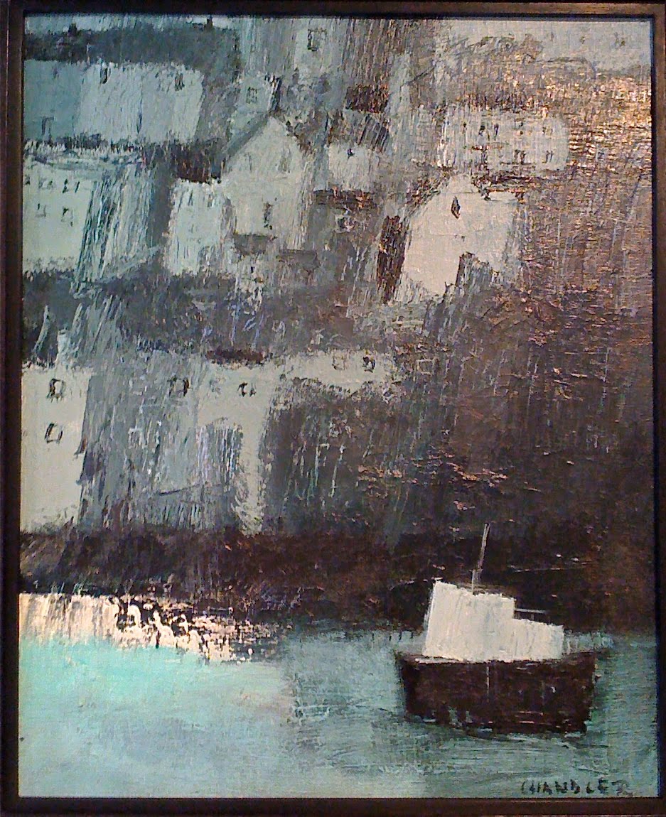
When you look closely at the picture, you'll see it's built up on quite a lot of paint. Under the surface are three or four other paintings that formed as the image took on a life of its own and I followed first one course, then another. To give you some idea of how often I change my mind, here are three other treatments of the same scene; the harbour at St. Ives:


You'll notice that in each of these, the boats are either safe on the harbour wall or tied up along the quayside. In my favourite painting, the boat is at sea at last, but whether arriving or departing, it is impossible to say. Certainly, there is nowhere in sight for the pilot to put ashore.

If your painting ends up as planned, you may well have gone on that long journey that finally takes you home.

But perhaps it means that your little boat never put out to sea in the first place.

Friday, 7 May 2010

Oceans Apart Part 1


Work by Duncan Cameron, David Chandler, Rob Irving, Lorna Heaysman, Jeanette Kerr, Simon Ledson, Melissa Olen

Air Gallery, 6 High Street Wells, Somerset, BA5 2SG

8th May to 12th June 2010


Watch This Space


Click here: Image Wall

100 canvases for Black Swan Arts, November 2010.

Friday, 16 April 2010

Dogs and Cats and Chemistry

It's a relief, on occasion, to turn away from the business of trying to make art and focus instead on simply recording what's in front of you.

When Van Gogh was painting with Gaugin in Arles, he attempted to use the latter's method of painting from memory and imagination. In the end, he had to concede that his best work was done when the subject was slap-bang in front of him.  More than anything, though, Van Gogh wanted sitters to paint from and frustratingly for him, all but a few of the good people of Arles avoided him like the plague. To the great benefit of the rest of us, the isolation forced upon him by his apparent craziness gave rise to the most powerful paintings of objects the world has seen; those iconic, yellow-on yellow sunflowers, for example, that have become universally synonymous with artistic struggle.

So what to paint turns out not to be the issue for most artists. If you love to paint, then you'll paint anything; sunflowers, chairs, boots, even the bedroom furniture. The real issue for most of us is how. Ten years of monkish devotion to art  and Vincent had that down pat, but it's something I've been struggling with for decades.


Thank providence then for the limitations of watercolour. Compared with oils and acrylic, there's so much that they won't do and so much that they do quite readily that is irksome. They stain, they run, they bloom and most vexing of all, they won't let you hide your mistakes. And the Bistre ink that I like to use, flocculates when heavily diluted and leaves texture where you don't want it.

Why use it?

I suppose because some us are dog-owners, while others prefer cats.

Oil and acrylic are dogs. They follow you faithfully, sit down and roll over when they're told and won't do anything without your say-so. Watercolours on the other hand, are cats. Whatever you have in mind, they are on their own agenda; winding themselves around your shins one minute and off through the cat-flap the next.

Van Gogh was a fan of watercolour, although he didn't exploit the medium much, declaring that you needed twenty-seven heads to paint a single picture.

It's Dorothy's birthday. I always paint daisies for her birthday card. Almost overnight, they've perked up all over the lawn and with their bright faces, they match her sunny, uncomplicated disposition. Pinching them out of the soil, however and laying them on the table in front of me, I feel as if I'm performing a botanical autopsy. But right now, rather than any new meaning I've conferred upon them, I'm more interested in the shapes they're making on my paper.

Call it artistic detachment.

After the sketch done in soft pencil, the bistre goes on, speckling, quite predictably in unpredictable places. I'm squinting at my daisies now, cutting down the colour information that's hitting my retina and concentrating on light and shade. Colour, tone, form, texture - Nature delivers them all at once and we separate them out like charity shop workers going through a bin bag. More bistre goes on once the first glaze is dry and then I get to work with thin phthalo green watercolour. Odd names. One ancient; one modern. The bistre, originally derived from boiling soot; the phthalocyanine, a petro-chemical by-product.

It's all chemistry.

Brushing aside any concerns about my carbon footprint, I finish the job with a little Translucent Yellow.

The Bistre, besides texturing the picture has tamed the watercolour; harmonised my colours, modified their tones and given the whole thing structure. The watercolour, you see, didn't have it all it's own way. But then again, neither did I and that's where the real chemistry is.

Thursday, 1 April 2010

You Looking At Me?

Self, acrylic on canvas 40 x 40 cm

Ironic, that in trying to get out of the way of the painting and let the materials do the work, I should choose a self-portrait. The important thing here is that the person you see is not scowling at the viewer or at himself, but at the painting.

Sunday, 21 March 2010

Angela's Little Red Digger

The last time I entered the Black Swan Arts Open Arts Competition, I did so years ago, with an oil painted specially for the event: a double-portrait of myself, blindfolded, with brushes in hand, being led down Vicarage Street by one of my models, who is wearing nothing but a big blue bow in her hair. In the words of the centre manager, the work was not so much 'rejected' as 'not selected'. The fine distinction was lost on me at the time and I remember feeling suitably stung for several months. I was a local artist, after all; I'd even put the Vicarage Street abattoir in the background. The episode served to persuade me that competitions and awards were not for me; that being a winner meant conforming to a jury's idea of merit and that true artists did not seek prizes.

This February, I entered for a second time and this time, I think, for a better reason. I wasn't out to impress or win a prize; I just wanted more people to see the painting than had seen it so far.


Angela's Little Red Digger is the centre-piece of a series of paintings of my hometown, Frome. The others depict various, well-known corners of the town and as a foil to the quaintness of the buildings, each one features one, two or more young men wearing white hoodies and baseball caps. My idea was to bring the topographical painting of Paul Sandby up-to-date. In his views of Windsor, for example, there is often an old loafer in a soldier's jacket leaning on a lump of masonry somewhere. Today, the white hoodie is ubiquitous throughout the market towns of England and is often regarded as an emblem of antisocial behaviour. The wearers are considered to be ill-educated, uncouth, given to trouble-making and vandalism.

The idea of Angela's Little Red Digger was to place these Frome pictures in a wider context and to contrast the anti-social behaviour implicit in them with the kind that is condoned by society in the name of progress. To research the painting, I ventured five miles out of town, walked for half a mile, tore my jeans on a thorn bush and arrived at the rim of one of the biggest holes in Europe. I felt like Frodo Baggins when he has his first glimpse of Mordor. The day was still and hot, there were buzzards circling overhead and there at the bottom of the quarry was a lone, red digger just asking to go into a picture.

Now the little red digger did not find its way to the bottom of that quarry all on its own. It got there with the aid of a fleet of trucks that are on the road day and night; a private railway line; high explosives; the annihilation of a village community; the compromising of the hot springs at Bath, and as the quarry operators venture below sea-level, the possibility that the Mendips will be heathland in twenty years time.

Angela Yeoman CBE, who sold the quarry recently for £300 million, is influential in many committees, trusts and clubs within Somerset. She is also Deputy Lieutenant of Somerset, a former High Sheriff of the County and is well-known throughout the region for her philanthropy.

Angela's Little Red Digger was selected by the judges of the Black Swan Arts Open Arts Competition and won the Bax Fine Art Award.

Friday, 5 March 2010

Bridging The Gap


This painting hangs in the corridor of the Birthing Unit at Frome Community Hospital. Continuing the theme of the Tree Of Life, which runs throughout the Hospital's decor, the challenge for me was to make a satisfactory composition from a single acorn on a 1.8 metre canvas.

Knowing that it's going to give me a lot of trouble, I buy two canvases and work on two paintings at once. My thinking is that I can play safe on one and takes risks on the other. The hospital will get whichever one that works. But what do I mean by 'works'?

As I begin to put acrylic onto each long canvas, I become aware of two things. First of all, painting is hard work. I'm full of admiration for the sheer physical achievement of Michelangelo's Sistine Chapel - here was a man, after all, who could work his way through a slab of marble the size of a garden shed; secondly, there is an aching gap between the picture in my mind and the thing that is appearing in front of me.


After a couple of attempts, this appears. The acorn is suitably egg-like but I feel as if that is all I'm looking at. It's a riot of over-charged hues, too.


On the second canvas, I begin working with unnatural colours, so that I can concentrate more on the forms that I am creating. If I can just get the shapes to work on their own first of all, the colours can come later. When I look at this stage of the painting, now, I believe that a more courageous artist would have stopped right here. But at the time, I press on, because I'm pretty sure that the midwives and ancillary staff would rather look at emollient greens than hospital pink and meconium yellow.


A thin glaze of phthalo green makes the thing look more natural, but the life goes out of it in the process. I'm stuck. If I do any more, I'll cover up all those loose brush marks that are giving the painting its energy.


So I return to the first canvas.  The acorn is better proportioned but the shadowy greens are overwhelming. And there's another consideration. The entrance to the Unit will be to the left of the picture and I feel that in this orientation, the image is turning its back on the visitor.


And so, I return to the second canvas, yet again. I decide that if I'm to keep my colours consistent across such a long stretch of canvas, I either need to mix up huge dollops of pigment or underpaint the entire thing. Underpainting will soften my colours and homogenise them at the same time. I also like the idea of being able to concentrate on an image that has a massy, sculptural quality to it. This isn't to be an attempt at a real acorn, after all, but something more iconic. After the carbon black and titanium white underpainting, I apply thin glazes of phthalo green, hansa yellow and pryrole red to the canvas with a sponge. I mix the colours with equal parts water and gel medium to improve colour flow.

Once it's up on the wall, there are a few complaints:

It isn't big enough; there aren't enough leaves; there should be a branch; one of the leaves is painted incorrectly. 

There is also a suggestion for improving it:

A Lowry-esque stick figure pushing a baby buggy across that empty horizon.

Another aching gap opens up.